Test little and often
Imagine you ran a fruit stall in a market. You’d chat with customers all day, and see which fruits they bought. You’d also see which fruits they did’t buy, either because they didn’t notice them, or because they don’t like them. You’d find out which fruit needs to be more visible, and which you need to swap for another fruit.
In dicovering what works for your stall, you’d build relationships with customers, speak in their language and learn why they visit.
Now imagine you make it big, and you run a national chain of fruit shops. You operate from a swish office at your headquarters. From here, how do you decide what works for your shops? You have stats and analytics for sales and visits, but not the stories behind them. You’ve lost the daily contact with your customers, and the insights you get from watching and talking to them.

This our position with websites. Ideally, we’d be like the stall holder, building relationships, observing and chatting, but instead we’re in our office guessing. User testing takes you back down to the market stall, to see how people actually use your site, and away from your guesswork and the advice of self-appointed experts.
Why get feedback

- To verify you are on the right track. The longer we work in a domain or organisation, the more we become a frog in a well. Our world closes in around us, and we assume the language we use is intuitive, and the knowledge we have is widespread. This is one way we suffer false consensus. We need to verify that the language and the structure of the site is intuitive for everyone, and that its interface is simple to understand.
- Users have brilliant ideas. If you can’t think what to call a group of pages, or you can’t decide where to put some content on your site, then ask your users. They often come up with fabulous ideas about how to organise and design your site.
- The key to commitment is involvement. If you ask for people’s feedback, you are showing that you value their opinion. This makes them more interested in the site, and more likely to give feedback in future.
Feedback is iterative
If you test with two or three people early on, it will be clear if people can’t see a button or menu. You can fix this, and then in your next tests your users will get past those issues, and run into other issues.
If you left the testing until just before launch, and tested the site with 30 people, most of them would get stuck on not finding that button or menu. You wouldn’t get chance to fix the problems further in the user journey.
Case study: putting users over gurus

In 2013 I was redesigning the site for King’s College, Cambridge. I read a blog article by a big name in web development, who said “If you work on a university website, then you need to use the label ‘Admissions’ for information about applying to the university. This is the standard term now.” We already used “Admissions” in the site menu, so I thought, “We’re fine”.
Then I did a card sorting exercise, where I made cards for each page or group of pages on the site. There were cards for things like “News”, “Library” and “Undergraduate Study”. Then I asked people to group the cards into categories, and give each category a name.
One person was stuck on a name for the admissions information, so I said, “Would ‘Admissions’ work for you?”
“No, that wouldn’t work at all,” she said. “That would mean admissions to the chapel.”
I was stunned: of course it could mean that! We’d never thought of it. This shows the huge value of feedback. It only takes one person to point out something you didn’t think of, but that when it’s mentioned is obvious.
It also shows that it’s better to base decisions on what your users find intuitive, rather than the advice of people who’ve never met them.
Who to ask for feedback
Ideally, ask the audience you identified in your strategy, but even a friend or a colleague not involved in the project is better than no-one. Anyone will notice that you can’t find a menu, even the non-target audience.
The worst people to ask are the ones familiar with the project, and the ones immersed in the organisation’s jargon.
If you get feedback from someone with strong opinions, who states authoritatively that “you need to do this” and “people won’t like that”, then be sure to also get feedback from someone less opinionated. The most opinionated people aren’t necessarily the most representative (see Beware false consensus).
Case study: the CAF bank relaunch fiasco
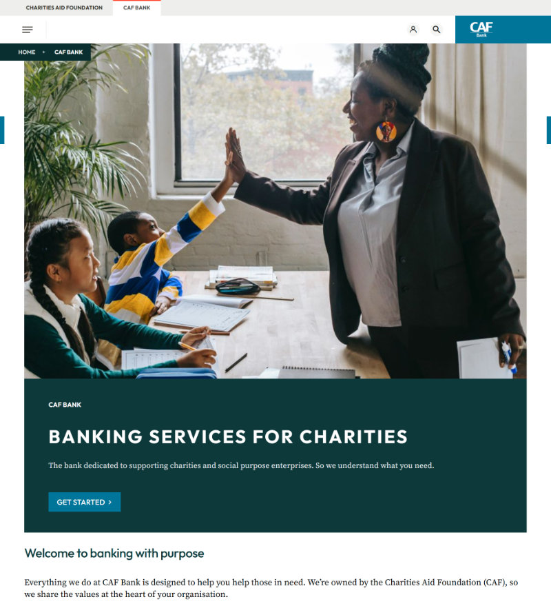
In the UK there is a bank called the Charities Aid Foundation (CAF) Bank. It is used by charities to deposit their money and make payments. In June 2025, it launched a new website.
Within a week, they had so many complaints they had to close their phone lines, and then take down the website. Although many problems concerned the back end system (e.g. payments not going through), the front-end website also had issues. Examples included:
- Unfamiliar conventions. Some people couldn’t find the main menu because it was not in a horizontal menu bar across the top (on desktop), but under a three-lined hamburger menu to the left. In addition, the three line were unequal length, so it looked like a paragraph symbol in Microsoft Word.
- Inconsistent terminology. On some pages a transaction was called a “transfer” and on others the same transaction was called a “payment”. What’s worse, these are different things (a transfer is when you transfer money between your own accounts, and a payment is when you pay into an external account).
- Inconsistent dialogues: in some screens the positive options like “Yes” and “Continue” (versus “No” and “Go back”) were on the left side of the dialogue boxes, and in other screens they were on the right. This led to people clicking the wrong options.
- Context changes: The new site allowed you to log in and choose which charity’s accounts to view. Let’s say you worked with charity X and charity Y. You could choose charity X and look at the accounts for charity X. But whilst working there you suddenly found yourself in a charity Y screen. As a result, it was easy to pay a bill for charity X from charity Y’s account.
Clearly no-one had watched a customer use this site before it was launched. Anyone interested in what customers said about it can look at the comments on TrustPilot (91% of reviews give it one star). Testing iteratively could have prevented the loss of customers and reputation.
How to get feedback
Informal chats
Feedback is an ongoing process, even after the launch of your new site or feature. Get all the feedback you can. Ask people at meetings and conferences, and in chats with colleagues, how they find the website. Did they find what they wanted? Do they have ideas for improvements?
Informal test sessions
Every now and then, ask someone if they will look at the site for you. This is especially important when developing a new site or feature. Tell them you want to watch them do a task, but emphasise that it’s not a test of them, but of the website.
I say this because some people say, “Oh, it’s no use asking me about websites. I don’t know anything about them.” Tell them if they have problems on the site it’s not their fault, it’s the site design.
Sit by them, or if you’re virtual then ask them to share their screen. Ask them what they have done on the site in the past, or what they did the last time they visited the site. Then ask them to show you what they did, and tell you their thoughts as they click around. It’s important they keep talking and keep telling you what they expect to happen next, and what they think of the page they’ve just landed on. Was it what they expected? Is it clear where they can go from there?
If you are testing a particular feature like an application system, then of course you can make the task more focused. You can ask people to go through that. Again, ask them to tell you what they’re thinking, and don’t give them guidance. If they’re stuck or confused, then ask, “What are you thinking?”
Be sure to take notes of the feedback. Compare the notes you take from different users and pick out the common themes. These tell you what you might need to change.
Formal sessions with a UX person
If your organisation has User Experience (UX) people then ask them to help you, or carry out some sessions. If not, and if you have the money, then you can hire UX consultants to conduct sessions for you, or give you advice about how to conduct them yourself.
Be aware that you will have to find the volunteers because UX consultants don’t usually find users for you.
Test without a design
If you are developing a new site or feature, don’t wait until close to launch before testing. You can test even before the site is coded, or has a design. For this, you can use “wireframes”. These are simple drawings of web pages, which only show buttons and menu items.
You can get software to make wireframes, but you don’t need it. If you are face to face you can just draw them on paper. Instead of people clicking on links, you can show them the wireframe and ask, “What would you click on?” and then show the sheet with the drawing of the page they chose (e.g. if they chose the “About” link, show them the wireframe of the “About” page). You can also use PowerPoint or Google Slides, and put links in to other slides, so the slides work like webpages.
Many people use software like Figma to draw wireframes, or go straight to complete designs (with colours, photos and so on) for people to click through. But if you use a full design it is easy to get distracted by aesthetics. The foundation of a site is not aesthetics, but its information architecture. This is how the information is labelled and categorised, and how you can get from one place to the next.
Think of it like signage and wayfinding in a museum. If you follow a sign for “Porcelain” and all you find is a room of medieval swords, which you can’t get out of, then it doesn’t matter how pretty the museum is. It’s still annoying.
A note on questionnaires
By “feedback” I don’t mean online questionnaires. I mean talking to someone in real life and watching them use your site. When someone visits your site or app this is a small chapter in a story of their life. They were doing something before they arrived on your site, and they’re going to do something afterwards.
Questionnaires are like web stats in that they don’t tell you the context of someone’s visit. They don’t let you see how people use the site and how they feel about it. Its also less likely you will get helpful suggestions from users, suggestions that arise from just chatting about the site.
Case study: feedback from a UX conference

Sometimes stakeholders say that there’s no need for user testing. The site looks fine to them, so it’s probably fine for everyone.
If that sounds unlikely, here’s a little anecdote. I was once at a UX conference where we listened to lots of talks on user-centred design. Then we had a workshop where we were split into groups of four or five people a table. The facilitator gave each person a piece of paper with an archery target on it, of three concentric circles.
“Just by yourselves,” she said, “in the centre of the target, I want you to write down the group of people who have most influence on your website. Then in the second circle write the group who has the second most influence, and in the third write the group who has the least influence.” We did that.
Then she said, “Now show everyone on your table what you wrote.” We put our sheets in the middle of the table and burst out laughing. Everyone had written “management” in the centre circle. The “users” were in the last circle. The management decided what went on the site, and weren’t interested in what the users thought.
None of this means you can’t do user testing. An advantage of the low-key testing approach outlined above is that you don’t need budget or approval. You can discreetly do testing and make or suggest changes that arise from it.
More about UX
The Nielsen Norman Group have many useful articles and videos on UX design, including a usability testing 101.